George Polk Award-Winning Investigation
Art direction and interactive maps for BI's first Polk
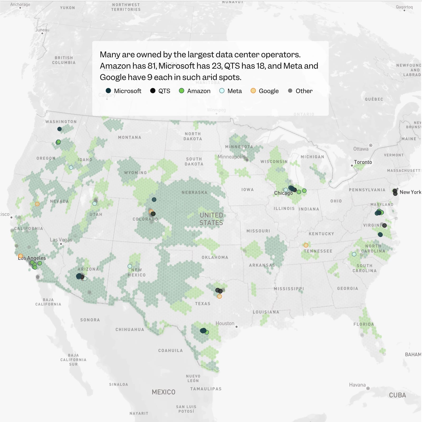
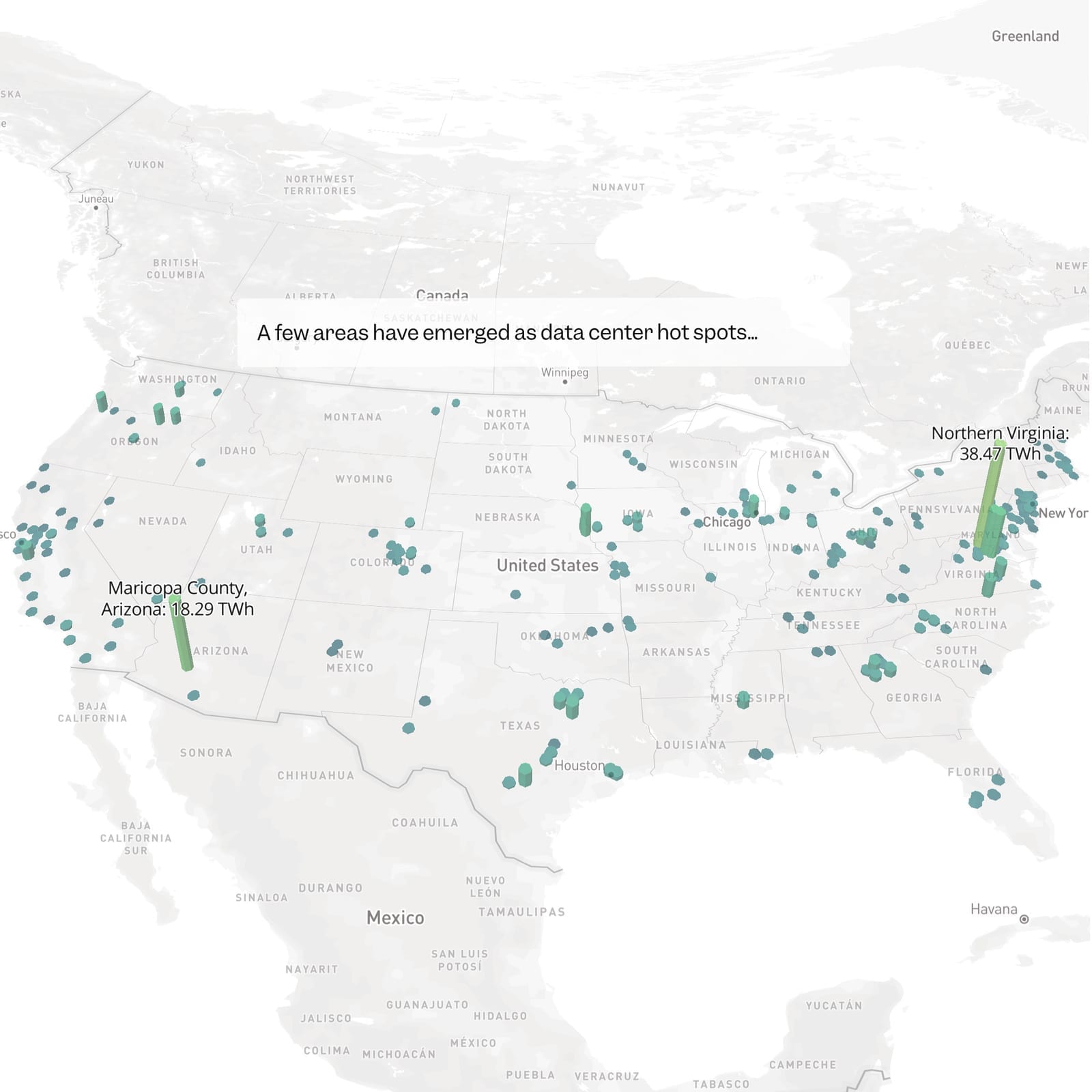
In early 2025, Business Insider's investigations team came to us with thousands of FOIA requests they'd assembled into the most comprehensive database of American data centers ever created — 1,240 facilities from the advent of computing in the 1970s to the present day.
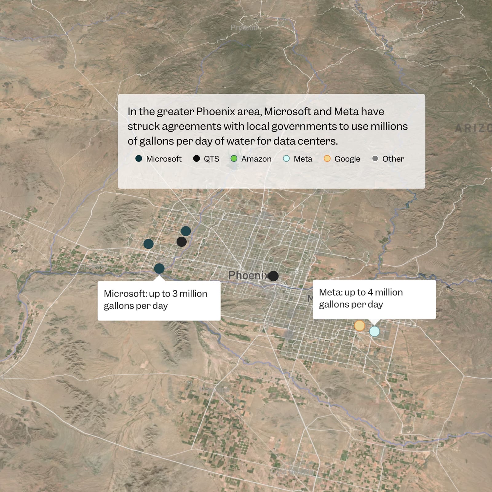
The visual challenge wasn't just showing 1,200 points on a map. It was creating coherence across a five-part series. We developed a system: pixel reveal headers that tie every story together, a consistent data bar treatment for bite-sized facts throughout, and scrollytelling maps for deeper exploration — one focused on water scarcity, another on the national footprint.
This wasn't consultant work. We embedded fully — BI email, access to their tools, developing new technology alongside the reporting for five months. The stories published in June 2025, just as the public was starting to grasp the scale of AI infrastructure. Since then, other newsrooms haven't just followed the coverage — they've created dedicated desks and hired reporters specifically to cover data centers as a beat.
In February 2026, the series won the George Polk Award for Environmental Reporting — Business Insider's first Polk ever. The database has been shared with 23 universities including Harvard, MIT, Princeton, Stanford, Yale, and Columbia, and cited in at least 15 policy briefs. The documentary has been watched more than 5 million times.
This is the kind of visual journalism capability we deliver — for newsrooms of any size.
Mobile-first scrollytelling
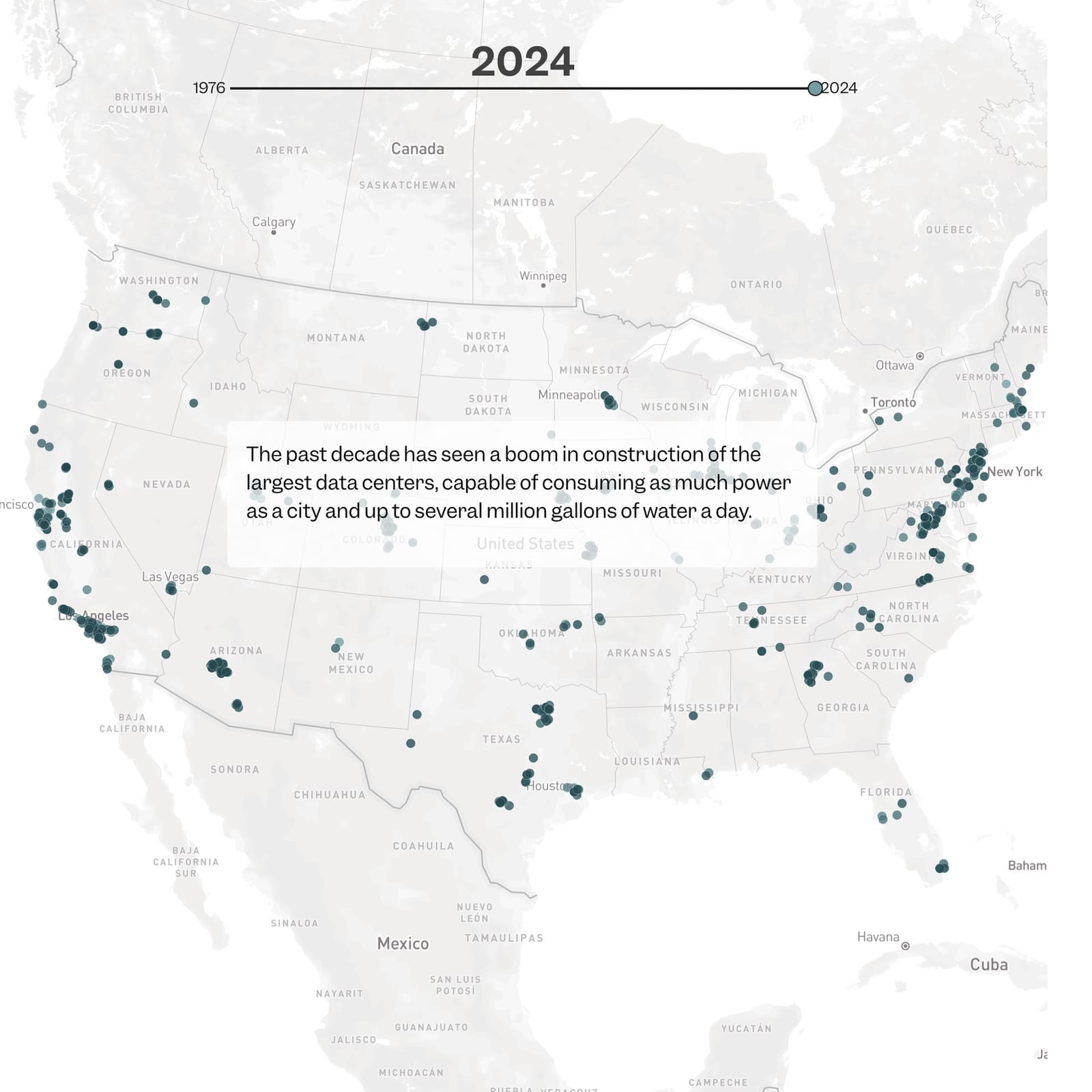
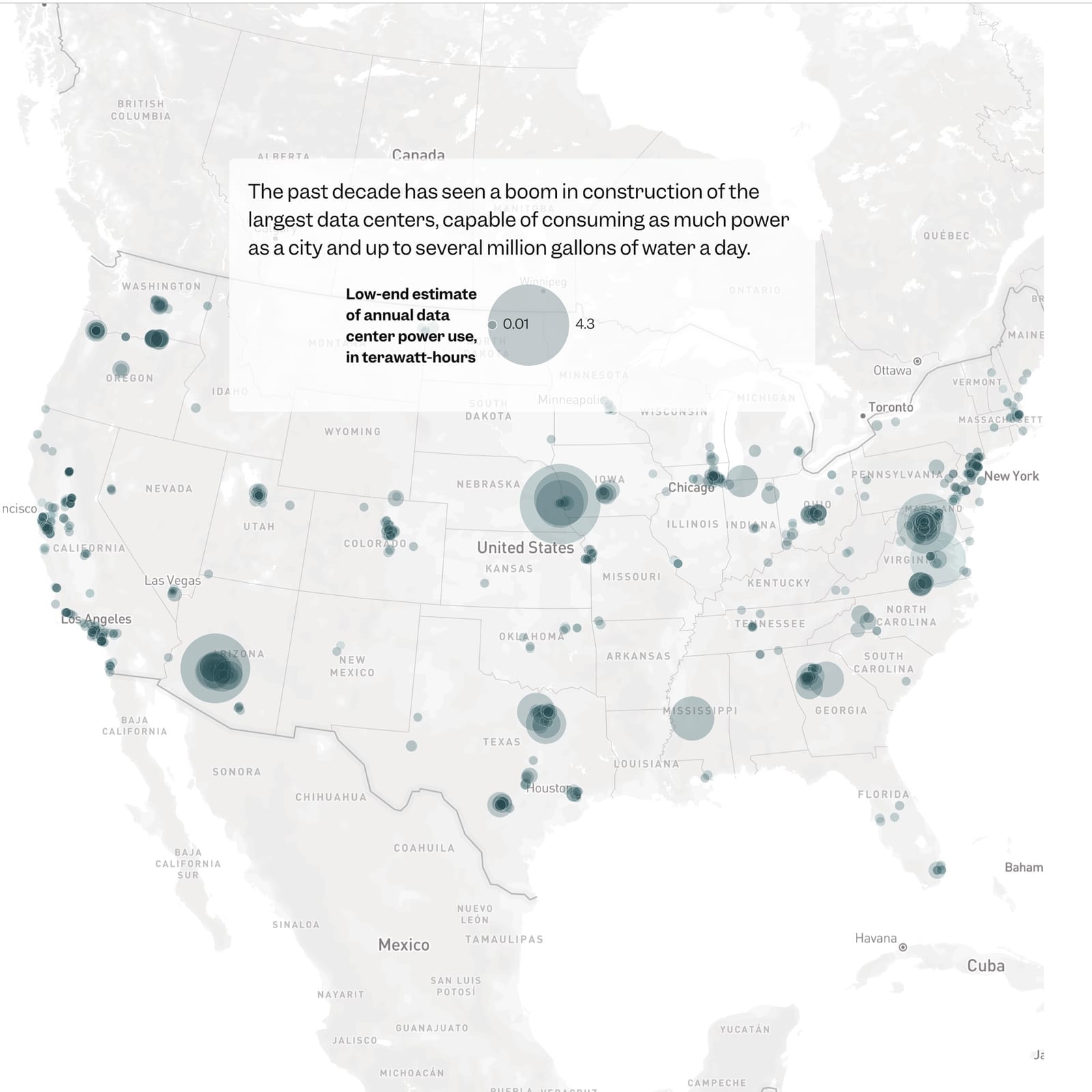
The national map adapted for mobile with scroll-controlled animation showing data center growth and power consumption by county.
We knew this was gonna be a series, and we needed to find a way to tie them together for the reader. We developed an animated reveal — a custom header for every story that brings them into the subject matter and ties all five together.
Business Insider's first George Polk Award
In February 2026, the series won the George Polk Award for Environmental Reporting — Business Insider's first Polk in the award's 76-year history. The judges called it "a thoroughly researched series highlighting the strain new and semi-secret facilities that fuel artificial intelligence are likely to place on communities."
The database has been shared with 23 universities including Harvard, MIT, Princeton, Stanford, Yale, and Columbia. It's been cited in at least 15 policy briefs. The documentary "Exposing The Dark Side of America's AI Data Center Explosion" has been watched more than 5 million times.
Since publication, other newsrooms haven't just followed the coverage — they've created dedicated desks and hired reporters specifically to cover data centers as a beat. The reporting belongs to Hannah Beckler, Dakin Campbell, and the team who spent years on the FOIA requests. The visual system helped their work reach the audience it deserved.
Sound of a neighborhood transformed
The Northern Virginia story included a custom audio scrubber comparing environmental sounds before and after data center construction — letting readers hear what residents live with.
Capabilities
Here is how we did it
GIS
Mapbox
Javascript
Scrollytelling
AWS
Svelte
D3
Data Visualization
Let's create
your visual story
Transform complex data into compelling narratives that drive strategic insights and decision making