Showing toxic plumes drift over Texas neighborhoods
NOAA atmospheric data rendered as scroll-controlled video
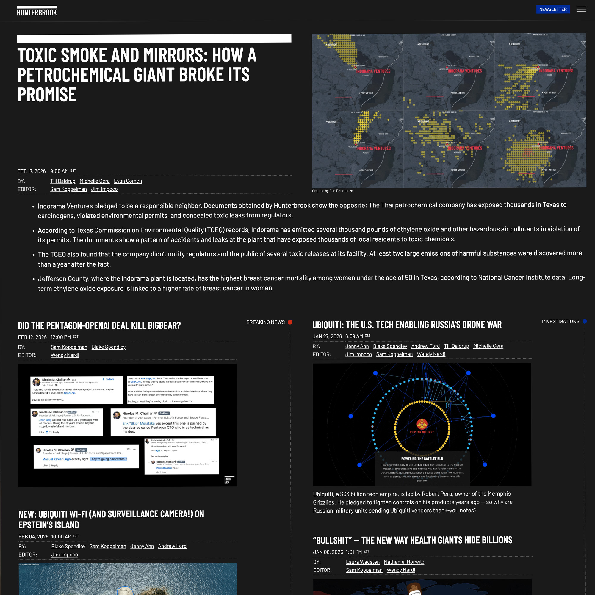
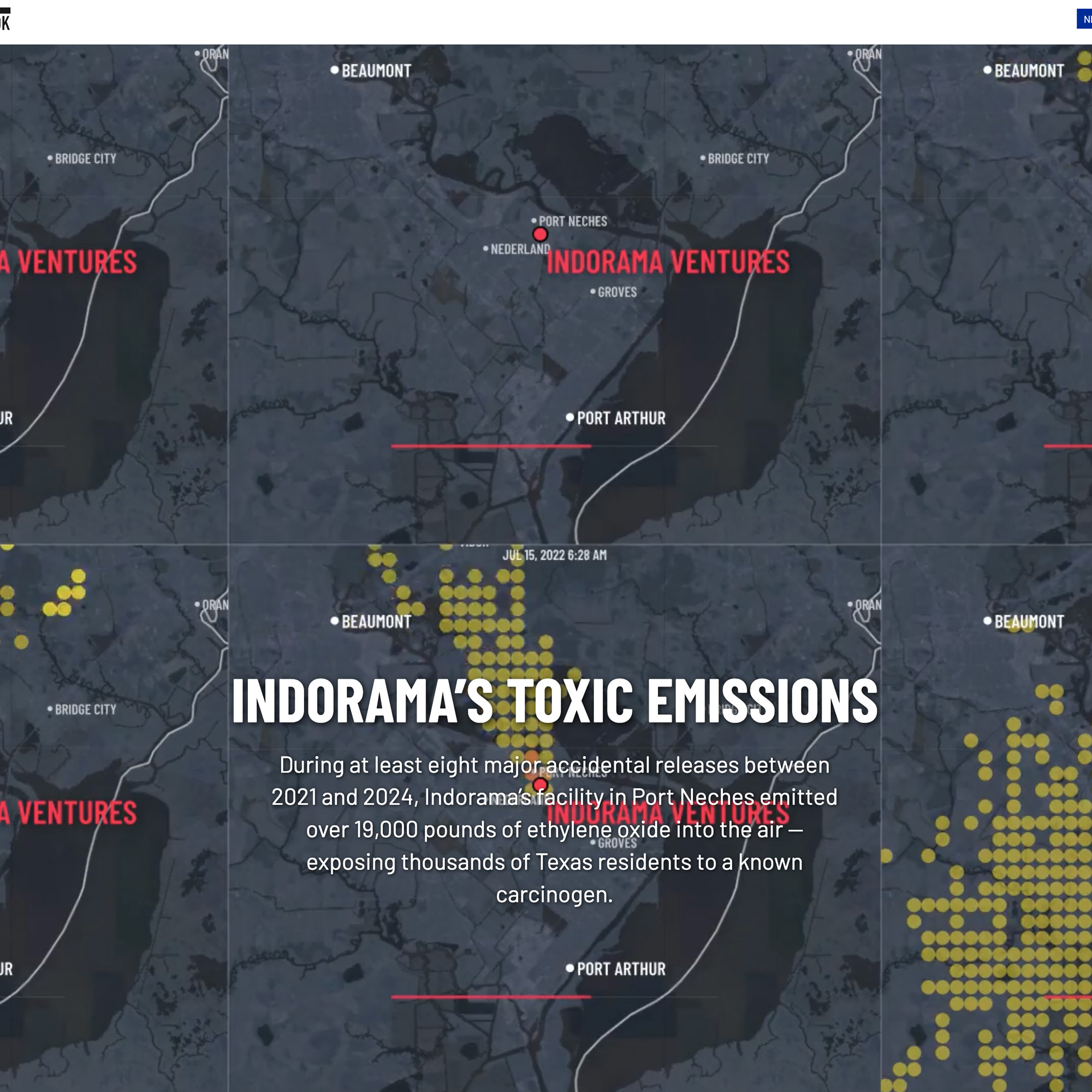
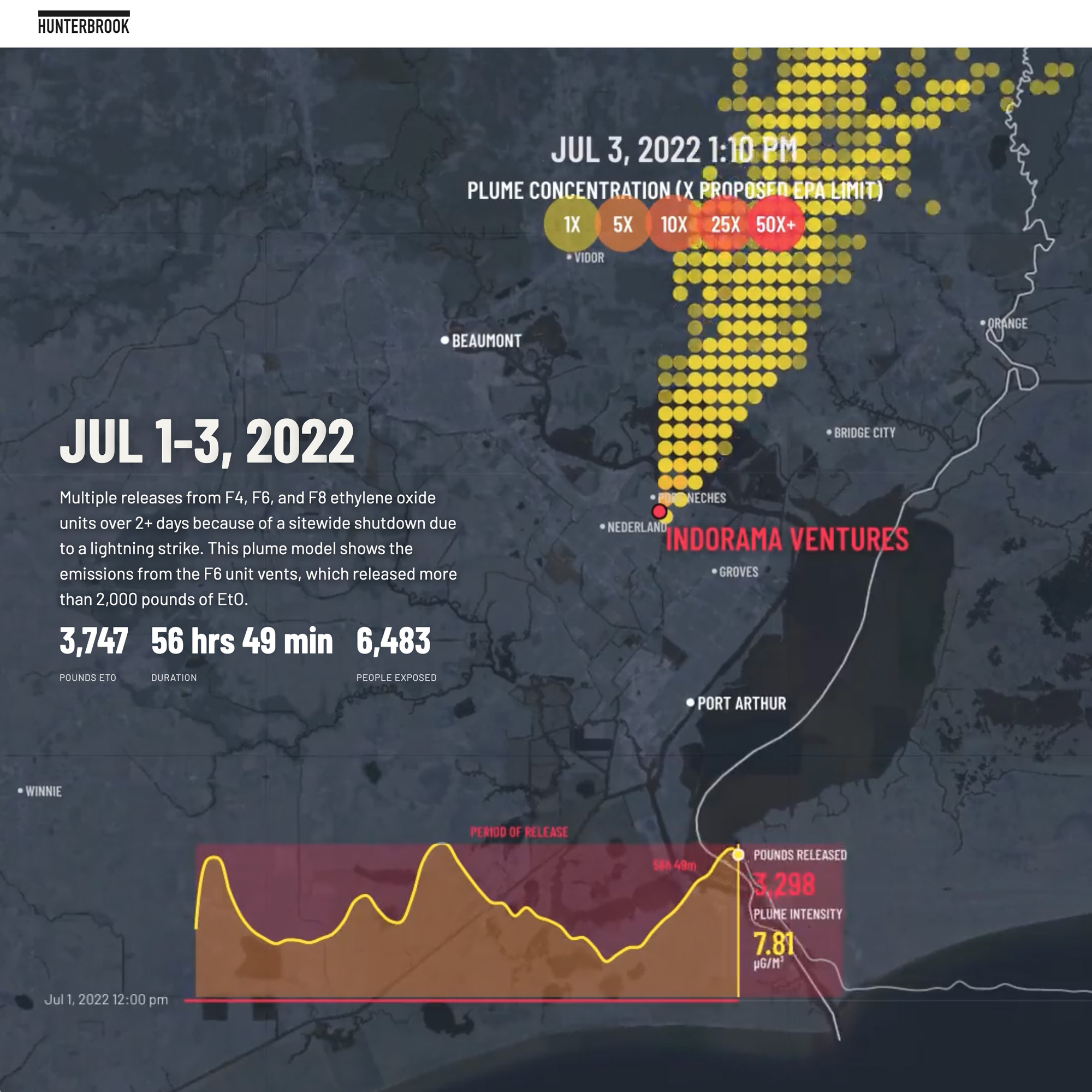
Hunterbrook's reporters combed through Texas environmental records and found seven incidents where Indorama's chemical plant released toxic chemicals over a two-year period. Some releases lasted three minutes. Others went on for hundreds of hours. The plant sits a few hundred meters from a grade school.
To show how these releases affected people, we engaged a consultant who ran the data through a NOAA atmospheric model. The output was massive — CSVs containing concentration data at every grid point and time interval, combined with meteorological information modeling how the plumes moved.
Our task was to turn that raw data into animations readers could actually understand. We colored each grid point by concentration level, showing multiples of EPA recommended exposure limits. The result shows the plume in motion — wind pushing it across neighborhoods, lingering or dissipating, intensity building and fading. Some readings hit 100 times the EPA maximum.
Mobile plume visualization
Portrait-optimized plume animation for mobile readers exploring the seven release incidents.
We didn't need to sensationalize it. We simply made the color scale show the number of times over the EPA recommended exposure. In some cases the plume was more than 100 times the maximum.
Proprietary graphics pipeline for atmospheric data
The data was too heavy for browser rendering. We used Node and Canvas — a raster-based renderer that takes vector commands, renders each frame individually, then compiles into video. The pipeline outputs multiple sizes automatically: desktop landscape, mobile portrait, and versions ready for voiceover content.
We built a scroll interface giving readers complete control. Their scroll scrubs the video back and forth — they can move through time, watch the plume expand, see it drift over the school and neighborhoods at their own pace. They're not passive viewers. They're exploring the data.
Reader-controlled plume exploration
We intuitively put the progress of the animation in the reader's control. Every mind processes visuals differently — every reader has a different appetite for exploring the data. The scroll scrubs through time, letting them watch the plume expand, linger, dissipate. They set the pace.
Capabilities
Here is how we did it
Let's create
your visual story
Transform complex data into compelling narratives that drive strategic insights and decision making