Showing how U.S. tech flows to Russian forces despite sanctions
Network diagrams for sanctions-busting supply chains
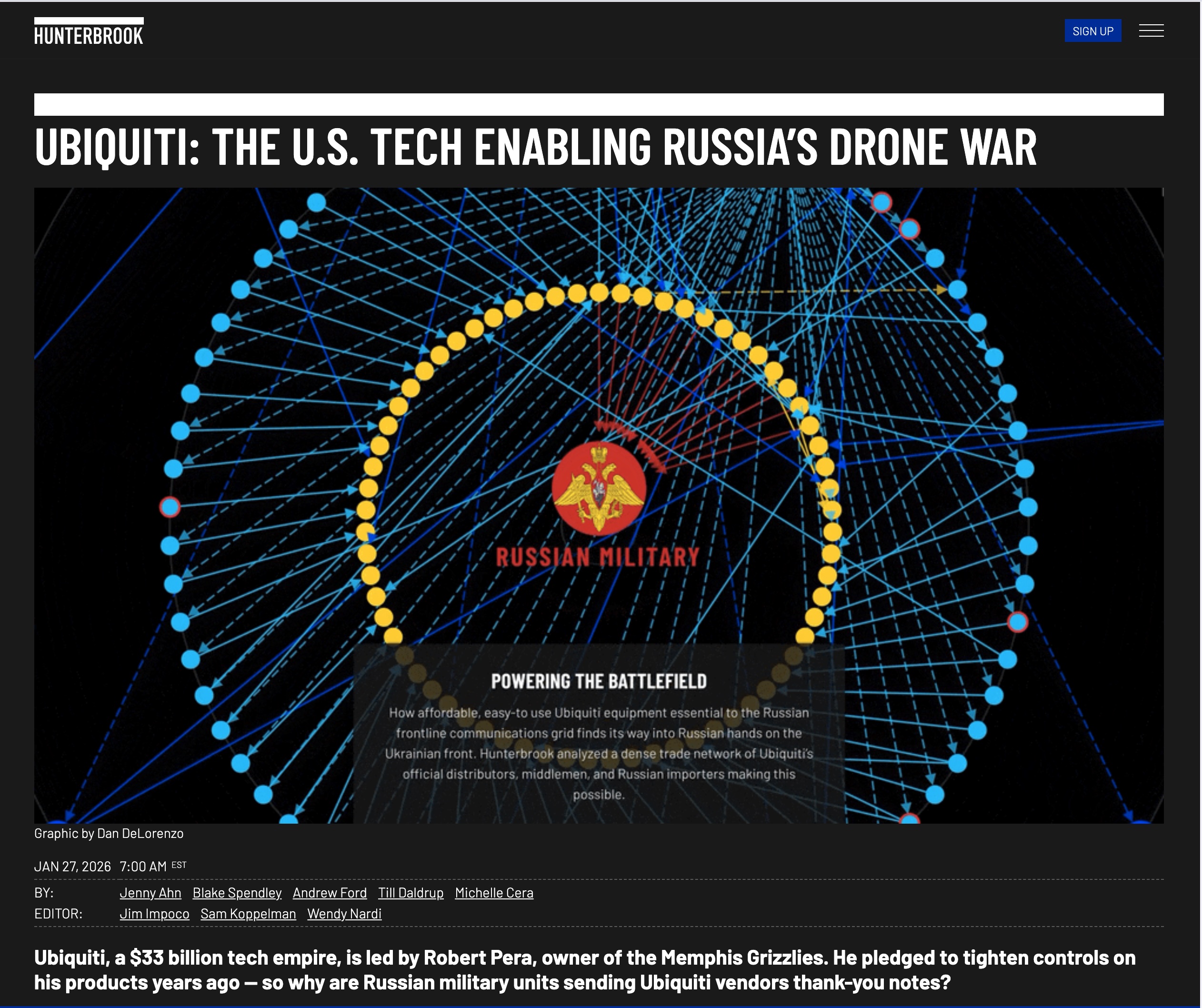
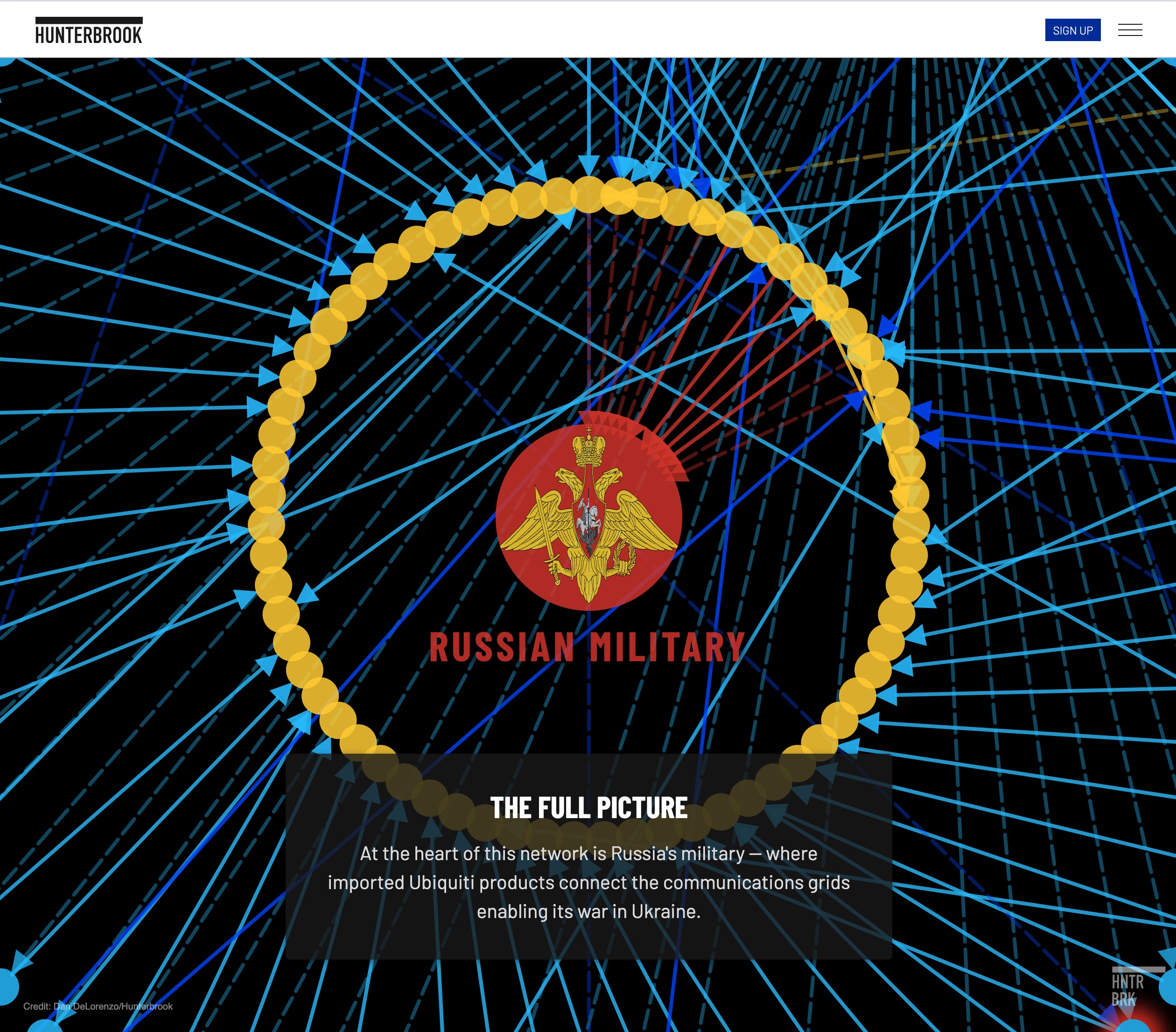
Hunterbrook came to us with a bird's nest — months of exhaustive research tracing how Ubiquiti networking equipment reaches Russian military drone operations despite U.S. sanctions. The data was all there: distributors, shell companies, transshipment routes through Turkey and Kazakhstan. Our job was to make it legible.
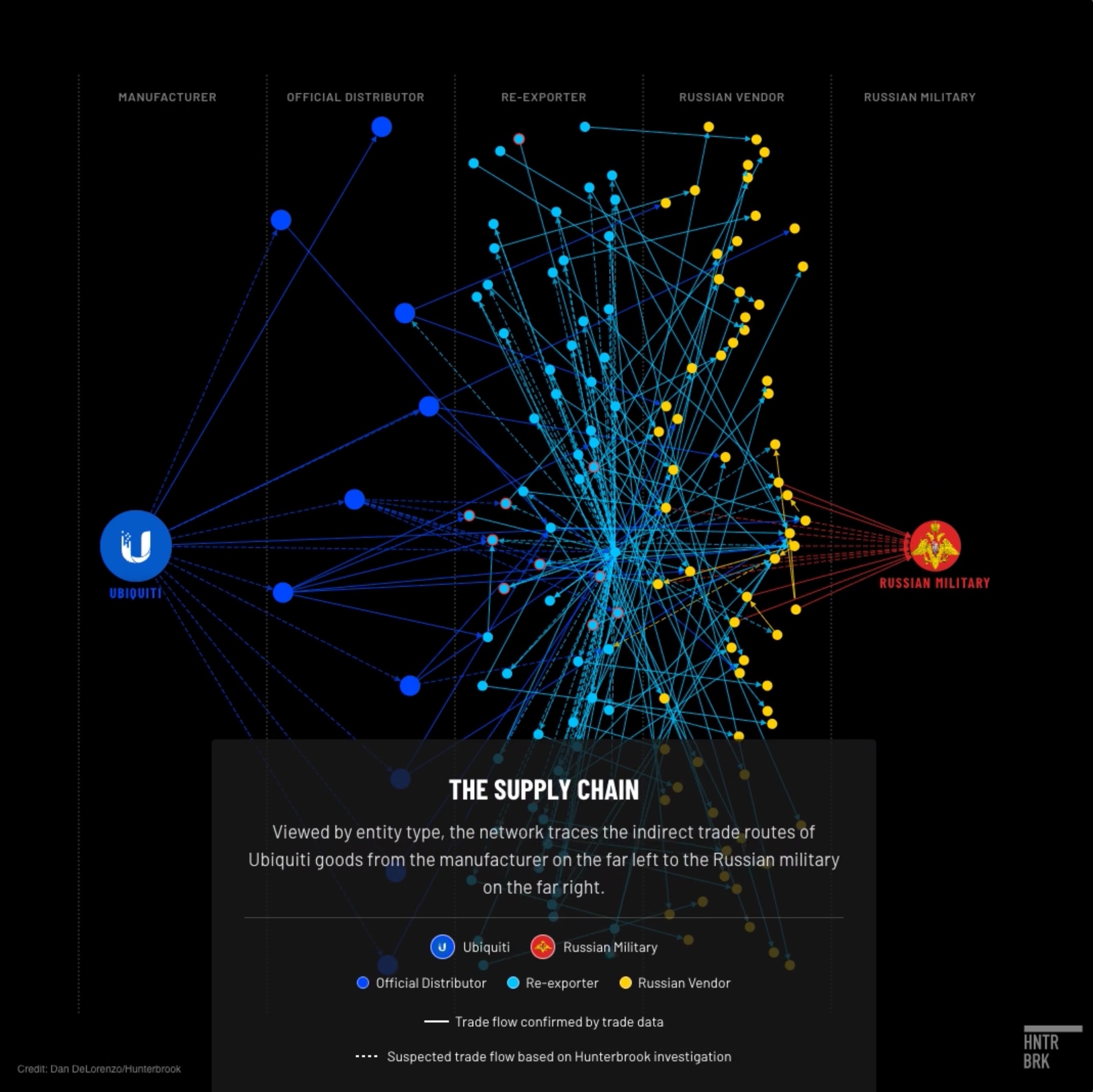
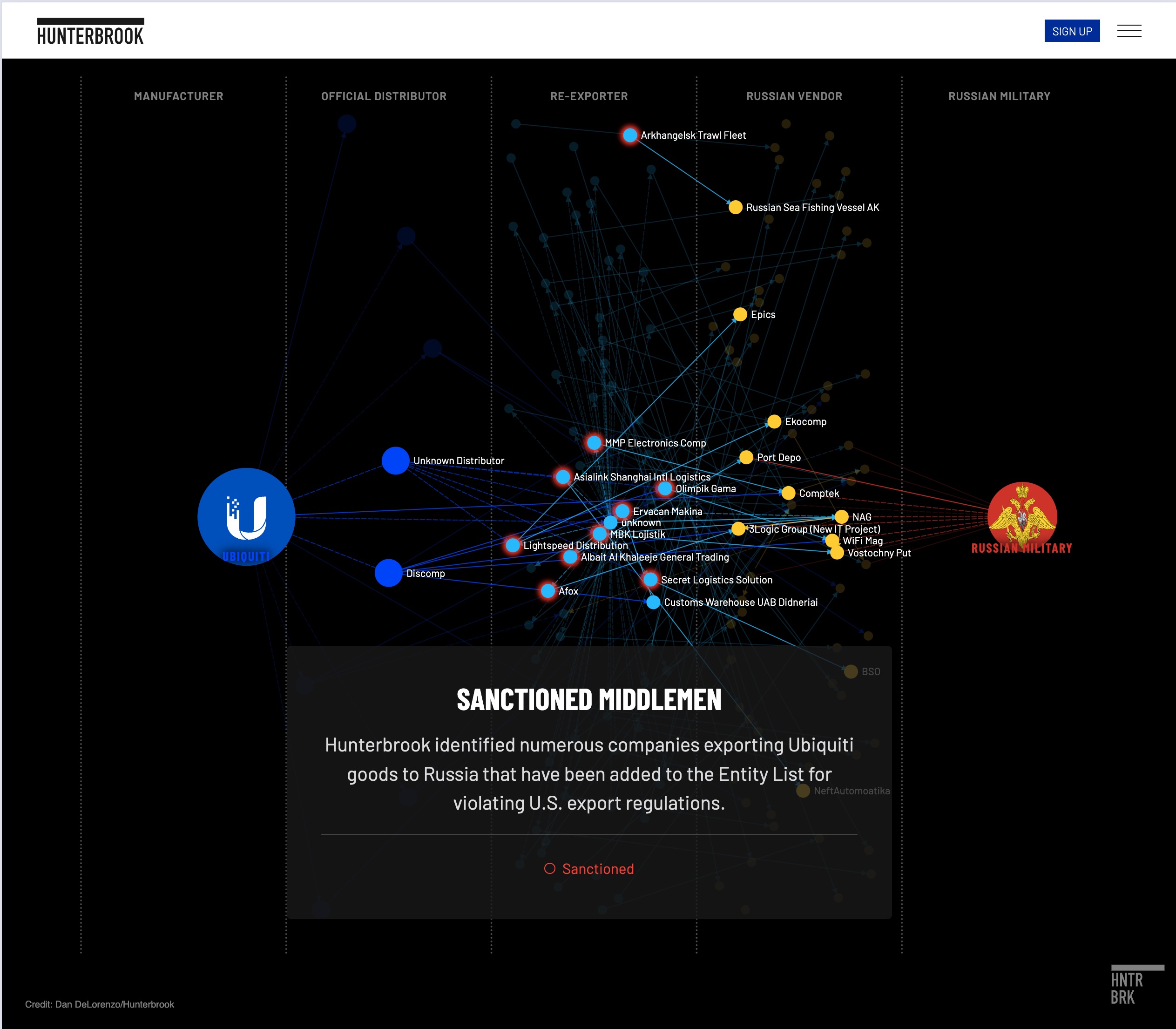
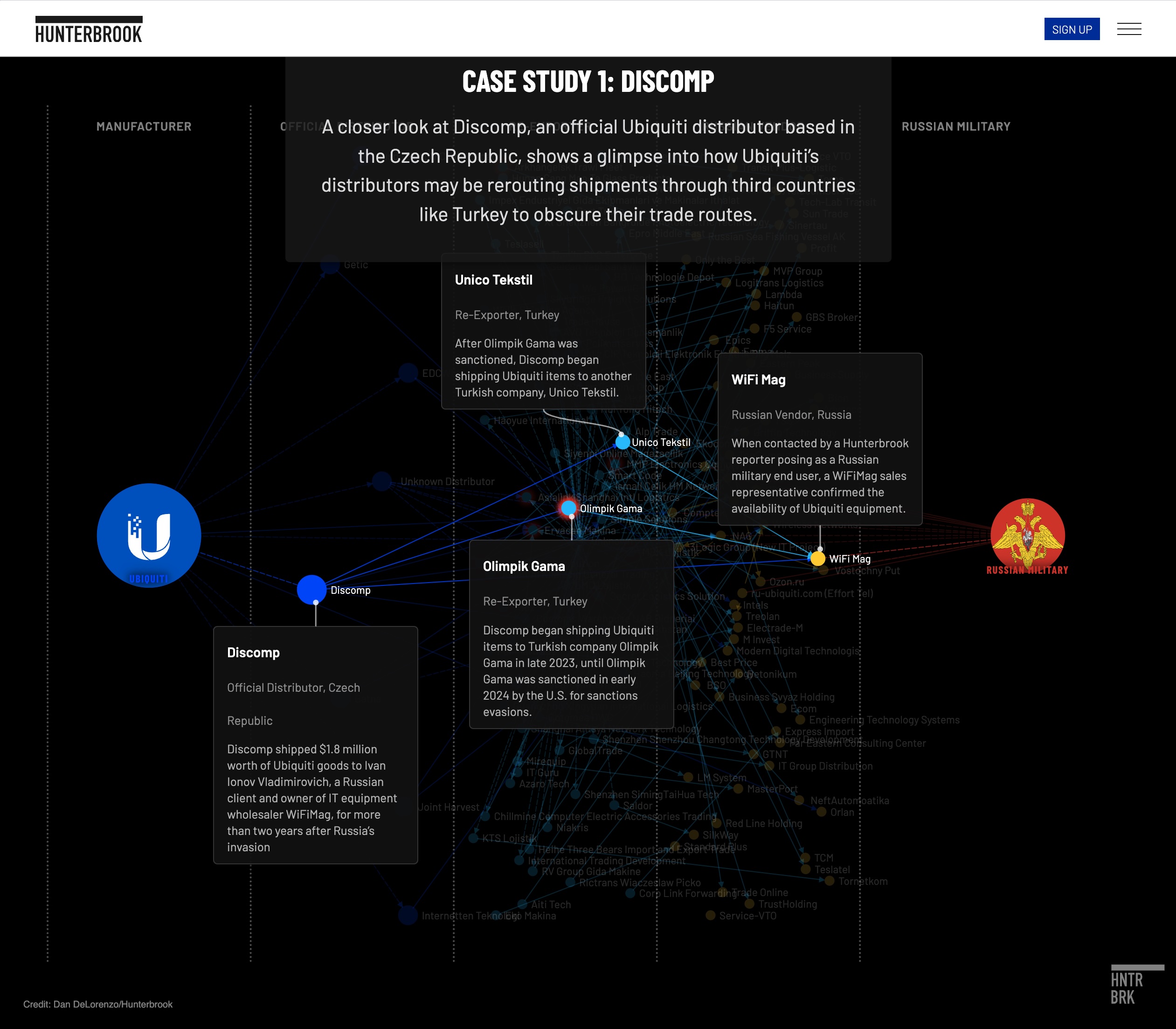
We structured the raw research into nodes and links — the classic framework for showing connections between entities. Once that data model was established, we had control. We could arrange the network by proximity, hierarchy, or geography. Concentric circles with Russian military units at the center. Left-to-right flows from manufacturer to battlefield. We tried map-based representations too.
The flexibility mattered. We built a debug version so the reporter could hover over nodes, identify entities, and refine the data. A shared spreadsheet fed scripts that generated the graphics. The same tool that helped reporters understand their own findings became what readers saw on publication day.
The animated lead art explodes the network and draws connections before the reader's eyes. It teases what's coming. When they invest their time in the full story — the 66% surge in shipments, the thank-you letters from Russian military units, the nine units accused of war crimes — they find it's more than clickbait. That builds trust between reader and newsroom.
Above: Network diagram showing transshipment routes; Animated supply chain reveal; Debug interface for reporter exploration; Mobile scroll-based case studies.
Mobile-first network exploration
Complex network diagrams don't translate directly to phone screens. We flipped the orientation and built a scroll-based alternate UX that walks users through detailed case studies — same nodes-and-links data, completely different interaction model.
We tease them with beautiful animation, then deliver the complete experience when they invest their time. It builds trust between the reader and the news outlet when they find it's more than clickbait.
The reporter's tool became the reader's window
We built a debug version so the reporter could hover over any node, identify what it was, and refine the data before publication. A shared spreadsheet fed scripts that generated the graphics. The same tool that helped reporters understand their own findings became what readers saw on publication day.
The complete story
The narrative takes readers all the way from Ubiquiti's warehouses to the battlefield.
Capabilities
Here is how we did it
Mapbox
Javascript
SVG Animation
D3
Let's create
your visual story
Transform complex data into compelling narratives that drive strategic insights and decision making